Friday, 24 June 2016

Editorial Illustration 3 (War crime related)


I love the colours in this picture. I bold and strong.
ideas that come to mind: Family is first priority. Danger. Bad guys. Want to be in charge.
The skeleton face is a strong feature.
This illustration in general is strong.
I think it was digitally made on Illustrator.

Editorial Illustration 2 (war crime related)


Colours: green, white, yellow
This tells me about how crime just happen no matter what the rules are.
Like how the poster says no fire zone but there is fire in the area.
I think its scanned or digitally drawn in.

Editorial Research 1 (War Crime related)


Text used throughout the image.
Black corner background
colours: yellow, green and white.
I like that words are everywhere throughout the photograph.
I think it was made in photoshop using the text tool.

Editorial Illustration research 3


  • Illustration was used for Forbes magazine. 
  • Softwares used are editorial design, graphic design, and illustration. 
  • I like how the text is laid over the the face. 
  • Colours: Green and black. Text is some kind of orange.
  • If you were able to zoom in you could see the detail that his face has. From the colour of his eyes to his facial hair. 
  • https://www.behance.net/gallery/37928191/Forbes-Cover-Illustration

Editorial illustration 2

Womankind Australia: Frida Kahlo

Mosaic portrait of Frida Kahlo for the 4th issue of Womankind Australia magazine.

  • Colours: Green, red, black, orange.
  • Effect is mosaic. 
  • I like that it's green in the background and her body is colourful with colours such as pink, yellow and purple.
  • Softwares used are digital art, editorial design and illustration.
  • I like that they made Frida Kahlo out of flowers. 
  • https://www.behance.net/gallery/32952645/Editorial-Illustration-2015

Editorial Illustration research 1

Book Covers

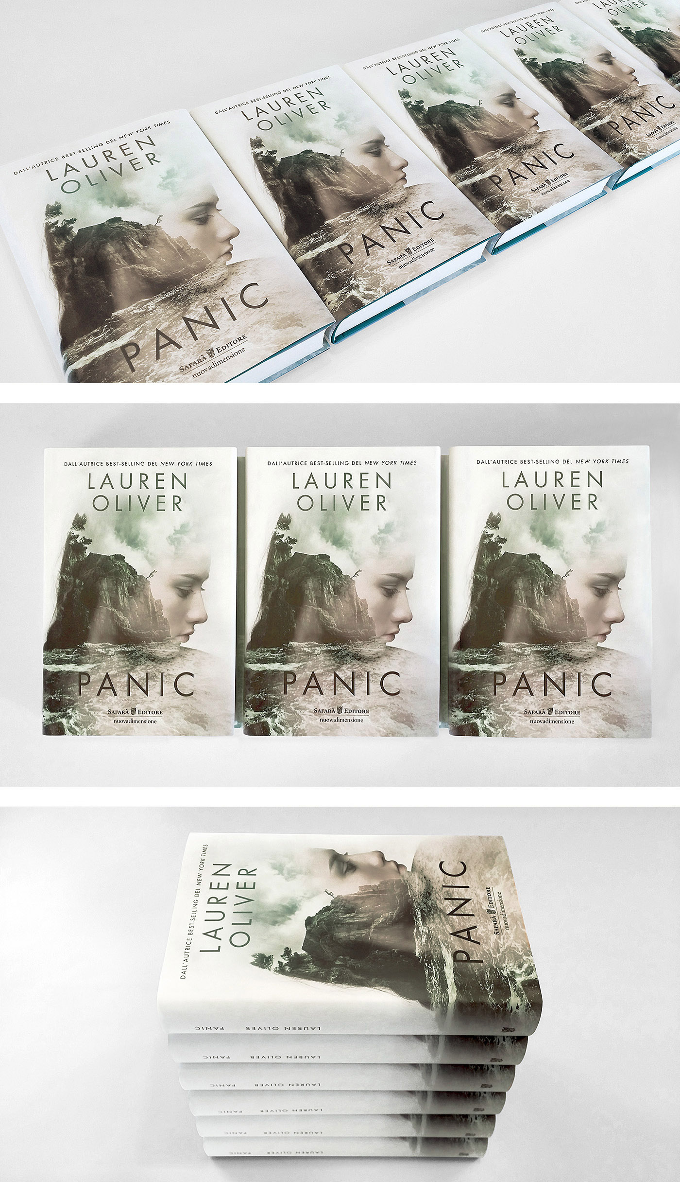
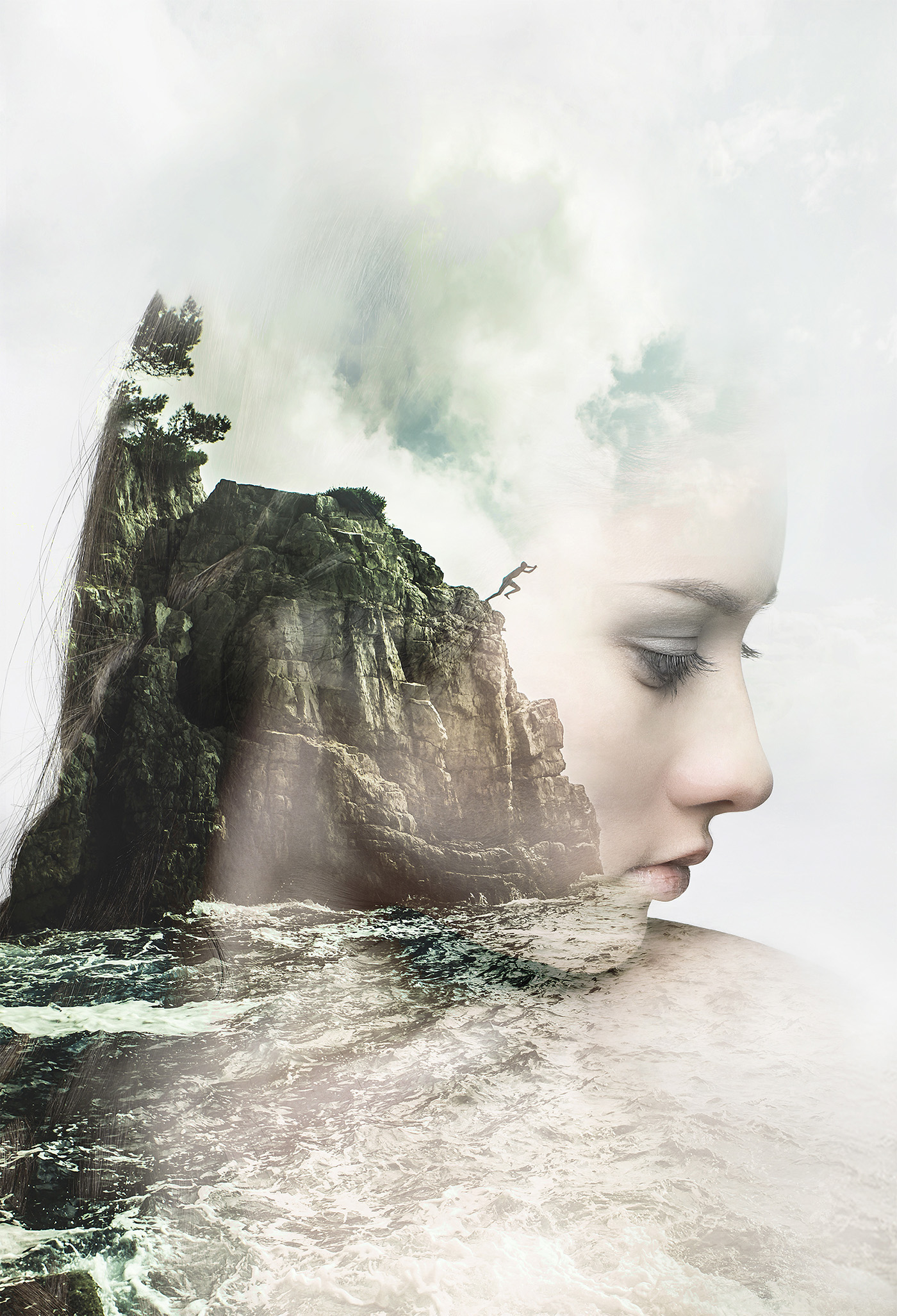
Lauren Oliver's Panic // Cover Illustration


  • Softwares used are Digital art, editorial design and illustration.
  • The effect that is used is double exposure. With the background photo used as the inside of the girls face. So with the background you are able to see the her features as well as the girls picture itself.
  • I think tools such as the eraser, opacity tools were used. 
  • Colours: Green, white, blue. 
  • Used as book cover
  • https://www.behance.net/gallery/30961467/Lauren-Olivers-Panic-Cover-Illustration 

Thursday, 23 June 2016

Ideas on editorial illustration,


I like the idea of skulls as a sign of the dead.
Double exposure would be a way I would want to portray my editorial illustration. 
Hand gestures would be something I also would want to do. They're strong and shows a lot of meaning.